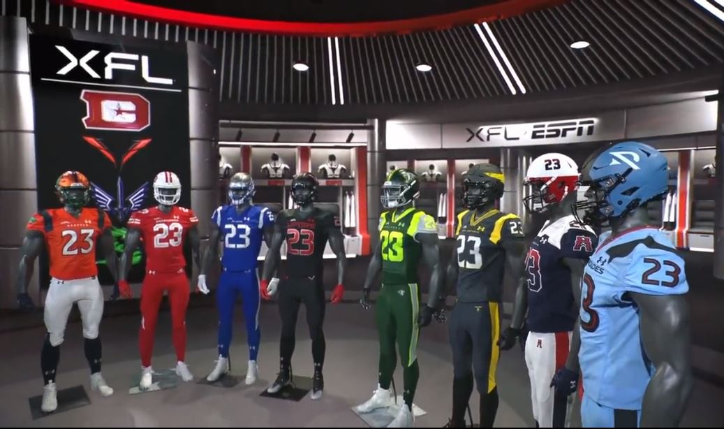
The XFL released each team’s helmet and uniform design last week and the response from fans has been predictably split. When it comes to jerseys or logos, everyone has an opinion and people often aren’t shy about expressing them.
Everyone…except me. OK, I have opinions – I think the jerseys are fine. But that doesn’t fill up a column. I just find it hard to get as worked up as others about this topic; certainly not enough to write a scathing treatise on the subject.
Nevertheless, the jersey reveal is a big enough deal to where I felt I needed to write something about it. But if I couldn’t properly assess the new threads, who could? I’d need to consult someone without any biases for or against the league that might factor into how they view the unis; someone unfamiliar with the 2020 garb that won’t hold the changes against the league and will look at the 2023 jerseys on their own merits.
Someone who has more of an eye for fashion than me and can give both objective and subjective thoughts on the color combos used. Where could I find such a person? Turns out, I didn’t have to look far: I decided to ask my fiancé.
She’s the most fashion-conscious person I know, a person I rely on to help me make decisions when I’m picking outfits to wear. She only has a peripheral knowledge of the XFL, but has seen enough football the past few years (sorry babe) to be familiar with the look of professional teams.
I asked her to look at the uniforms and helmets using pics and videos provided by each team’s social media accounts. For those teams returning from 2020, I also asked her to compare the jersey, helmet, and logo combination with the previous version. Without further ado, here is the ultimate, definitive, final and correct say on the XFL’s wardrobe choices for its eight franchises, ranked (by her) from first to worst.
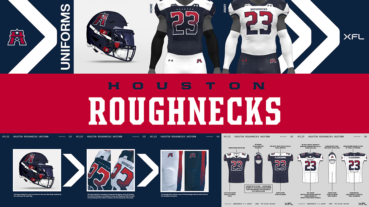
1. Houston Roughnecks
“This is the one that stands out the most out of all of them,” she said. “Overall this is my favorite.” And eventually, once all had been analyzed, Houston ended up on top of the rankings.
Among the highlights for her was that the pants were a different color from the jersey, a feature not all teams had. “It’s a nice jersey,” she commented. “The only thing is that, with the navy blue jersey, I like the fading of the red into the blue on the numbers, but it blends into the jersey…against the white it looks really nice.” She ranked the away jersey slightly above the home top.
She liked the 2023 version a little bit better than 2020. As for the 2020 outfit, she said, “It’s a nice uniform…if the USA had a national football team, I feel like that would be the uniform, with the star and all that…very patriotic.”
“If I were to think of a traditional football uniform, I feel like it would be the 2020 one,” she said. “However, the 2023 one…the design and everything looks like every detail was carefully done for it to all come together. And it looks modern, it looks really nice.”
2. Seattle Sea Dragons
My fiancé had a few issues with the logo, but clearly she didn’t hold it against the overall look. “It looks like it’s supposed to be fire coming out of the Dragon’s mouth, but it looks like a tongue,” she said. She did like how the dragon was made into the shape of an “s” on the helmet.
“I like this,” she said when watching the video of the coach and quarterbacks seeing the uniforms for the first time. “It has that contrast that I like where the pants and the jersey are different colors. I think that stands out to me a lot.”
“I think I’m a Sea Dragons fan.”
Her first reaction to seeing the 2020 uniform and logo: “Oh see that looks more like fire,” she said of the logo. “I think I like that dragon…the other one looks a little bit more cartoonish.”
She was not as complimentary about the uniforms themselves. “That green looks out of place. You can’t have a forest green and a navy blue together. Either the blue had to be lighter or the green had to be more of a vibrant green.” She was also not a fan of the white helmets.
“This one’s easy, for sure the 2023 one looks a lot better.”
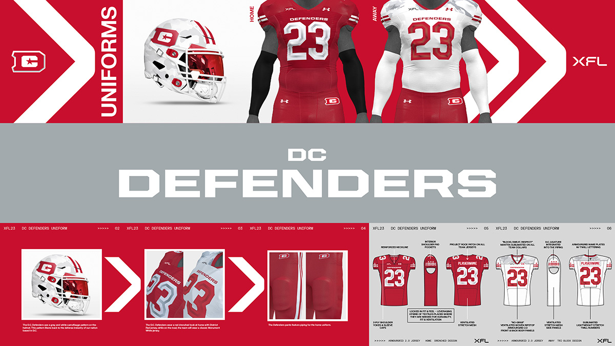
3. DC Defenders
While the red and white colors returned, the big change on the jersey was the inclusion of a Camouflage scheme within it. My fiancé found that to be a winner. “I like the pattern on the jersey…it’s a little bit of Camo. I like that a lot,” she said. “I do appreciate that detail.”
“My favorite thing about it is the detail on the sleeve…you can see the ‘DC’ is integrated into those lines. I like that.”
The colors may have remained from 2020, but the main logo did not. She didn’t really understand the inclusion of the lightning bolts on the helmet in the 2020 logo. “It reminds me of AC/DC (the band),” she said of the bolts.
“There are some differences (in the jerseys) but I think not super noticeable because red is such a strong color anyway, that’s mostly what I saw.”
“I think the 2023 one wins too.”
4. St. Louis Battlehawks
This will easily be the most controversial choice my fiancé made. When Anthony Becht called the Battlehawks’ jerseys the best in the league in the video revealing them to the coaches, she said, “I disagree with that comment.”
“I like the sword for ‘battle’ and the wings for the ‘hawks’,” she said. “It’s a nice-looking jersey. I like the color. It’s vibrant.”
“The other ones, I feel like…this is one of the more vibrant colors compared to the rest of them. That’s how this one stands out.”
When comparing 2020 with 2023, she again made mention of her preference regarding the jersey/pants combination. “See I like that better, the different colored pants and jersey…I like the jersey of 2023, I just like the contrast of the different colored jersey and different colored pants of 2020.”
She even went so far as to prefer the helmet of 2023 to the 2020 version, sacrilege amongst some XFL die-hards. “I like the design on the helmet for the 2023 one much better than this one (2020),” she said.
“I think overall, the new one, I feel like the blue is a nicer blue and the helmet is a lot nicer as well, I think the design is clean, it’s sleek.”
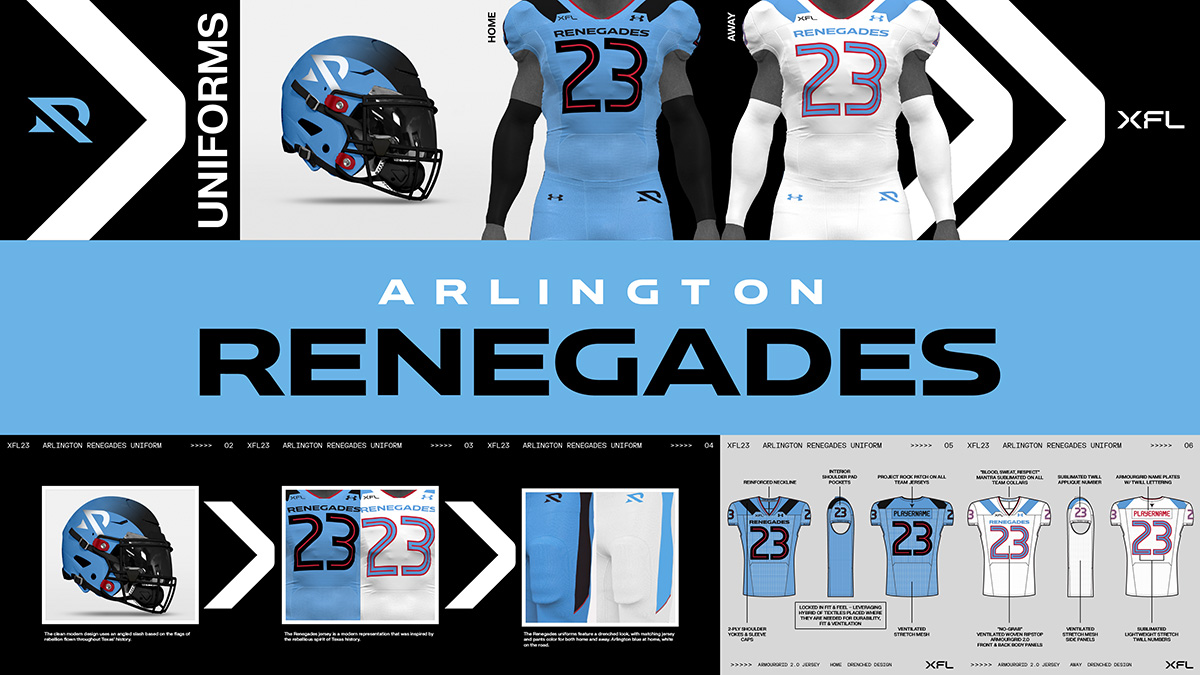
5. Arlington Renegades
“It’s a nice color combo,” my fiancé remarked about the Arlington threads. It was at this point, after having seen three sets of uniforms, she took a step back and commented on what she had seen of them to this point as a whole: “They just kinda all look the same to me, just different colors. I feel like the numbering is the same, size, same thing with the team name (on the jersey).”
She had a good laugh at the Renegade logo on the helmet from 2020 (I won’t reveal the two 2023 team nicknames that she laughed at when she heard them).
“I like those better,” she said of the 2020 Renegades livery. “I like the emphasis on the number, I feel like the font for the numbers in 2023 are so thin, for all of the teams…maybe it’s just because I’m used to seeing it on the NFL but the numbers are big and bulky and you can see which player is who on the field.”
“I definitely like this design (2020) better than the 2023 one,” she said, making the Renegades the only team returning in 2023 whose uniform in 2020 she liked better.
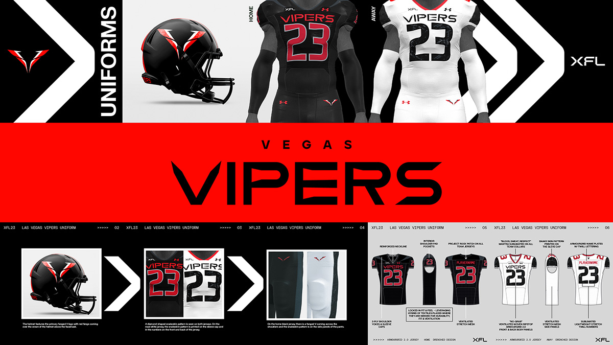
6. Vegas Vipers
For the Vipers, the first thing my fiancé took notice of was the “V” logo on the helmet. “I think this looks like a fancy car logo,” she said. I followed up with her and she clarified that she meant it as a compliment.
While she liked the helmet design, she felt that a more prominent logo in the form of a mascot would’ve worked better. “I like that, it’s nice and sleek, it looks modern, but I feel like part of a sports team is having a mascot be pronounced and I don’t see that here.”
“I like that detail in the letters. It looks really nice,” she said of the uniforms. In observing the Vipers, she noticed the Project Rock logo on the back of the uniform. She was confused about that at first until I explained to her The Rock’s relationship with Under Armour. She also loved the detail of the scales in the uniform numbering.
“There’s a lot of detail in the uniform…I feel like that’s so much work for it to be not that noticeable. I don’t think a lot of people are actually going to look at that. I would’ve spent more time on a logo with a cool-looking viper, because I just feel like sports jerseys, yeah they should look nice, but it’s not so much about fashion and design but showing more of the spirit.”
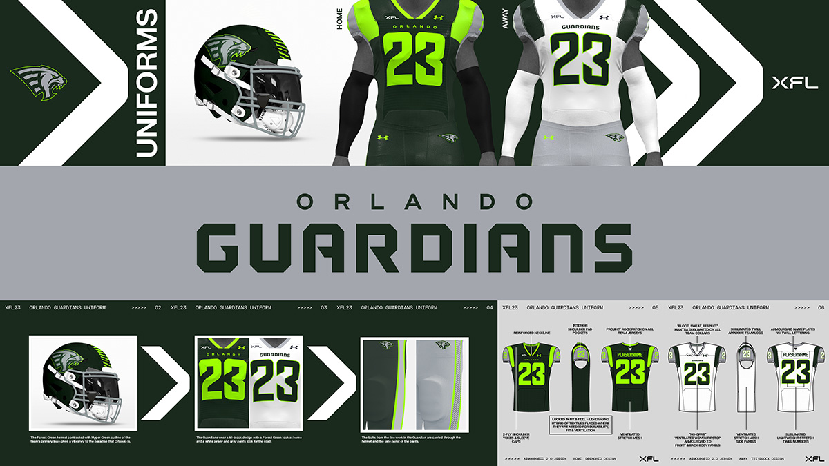
7. Orlando Guardians
When we looked at the uniforms for the Guardians, she had some questions about the logo. Specifically, what it was supposed to be. I took her back to 2020 and the New York Guardians logo, and how it’s changed since then.
For the Guardians, she liked both the white away jersey and the home one. For the home jersey, she said, “It’s a nice jersey…I like the contrast of the colors, the light green with the dark forest green.”
“I do like the white one a lot.”
8. San Antonio Brahmas
The first jersey my fiancé looked at finished last on the list. “It reminds me of a high school uniform. The quality doesn’t look as nice as the NFL ones,” she said of San Antonio’s uniforms.
On a positive note, the home jersey was a winner: “The color combination looks nice. I think the black and gold works good.” She also liked the helmet.
Where she was most critical was with the away jersey and specifically, the shade of yellow used. “See, that’s not doing it,” she said about the away uniform. “The away jersey I don’t like as much as I like the black one. The yellow looks like an American cheese single.”
“It’s not a good yellow, it should’ve been more gold.”
Final Analysis
“I think the jerseys overall are really nice. I wouldn’t say there’s one that I strongly dislike. I think all of them look really nice. All of them show how much thought went into the details and making sure there was some sort of, either the history or detail embedded into them. As well as the teams, how for example the Roughnecks, based on the history of the oil…same thing with the St. Louis Battlehawks. I can appreciate that, how they want to represent the culture of the city in the teams. I think they’re off to a good start. It looks nice, clean, professional… there definitely seems to be some uniformity within each team’s set.”
There you have it: The only jersey opinions that matter. Well…to me anyway.