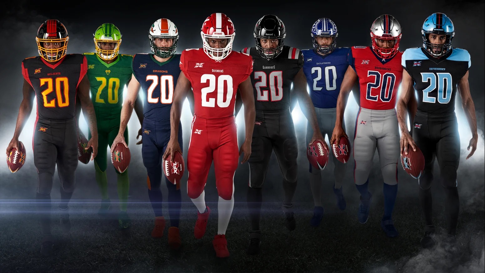
XFL Uniforms: The XFL has revealed the uniforms for all eight of their 2020 teams. (Image credit: XFL.com)
Nearly two years in the making and on the eve of football activities starting up with over 500 players reporting to minicamps, the XFL unveiled the uniforms and helmets for all eight of their teams. Since January of 2018, the resurrected XFL has changed its appearance from the league it was nearly two decades ago. Internally and externally. Today’s XFL is a marked departure from the original XFL in its approach, tone and overall presentation, and team identities and uniforms presented reflect that.
Anytime team uniforms, team names, colors or logos are presented for the first time, there can be a polarizing reaction to them from the public. It’s all very subjective. Sports fans have preferences of styles and particular color combinations. Iconic brands and uniforms from teams like the Steelers, Yankees, Cowboys, and Raiders have a history behind them. It means something extra when a player puts on those uniforms because of the history and legacy attached to them. Hence the term rooting for the laundry. As a startup league, The XFL doesn’t have the advantage of time served, but its uniforms will still be measured and compared to all the uniforms that have come before them and that exist today. There’s a fine line the XFL has to tiptoe around… be unique and original but not too radical. There will be criticisms levied against the XFL’s uniforms for all those things. The XFL, for better or for worse, based on it’s past almost two decades ago has a negative perception attached to it. So anything they present will be judged by some differently and harshly at the outset. A team’s uniforms or helmets are a big part of its overall identity. Fans take sports uniforms seriously because there is beauty in them. There’s something about a uniform worn by a group of people that symbolizes oneness and togetherness. In sports, it’s the bonding of a team together with its city. As a start-up league. The XFL is trying to form a bond with football fans. Today was the next step in that journey.
The time has finally arrived. Let’s take an in-depth look and review all eight of the XFL uniforms.
DC DEFENDERS UNIFORMS
Classy look. Love the simplicity shown in this design. A very good choice. Less is more and it leaves an opening down the road for potential alternate uniforms that potentially incorporate a third color into the mix. Like the team name, which is supposed to embody all the great defenders in DC history, past and present, the logo itself is a hybrid as well and is incorporated nicely here. The team makes good use of a variation of the coat of arms and the DC flag. It’s a really nice touch. The uniform has a retro feel to it and yet still feels new. So many modern-day uniforms are very busy in incorporating several accented colors into play. This is the anti-modern day uniform but in a good way. The temptation here would have been to add a third color. Either blue for patriotic reasons or a black to offset the bright red and white. Interesting that the teams’ actual shield didn’t play a bigger part in the design. This one overall is a winner because of its less is more approach.
DALLAS RENEGADES UNIFORMS
Good, but not quite what I expected. The red in the uniforms is a very unique combination with the powder blue color. Where the entire look stands out most is in the helmets. The Renegades blood-red eyes are piercing. They stand out from a mile away on what is a really nice looking helmet. Three of the XFL’s teams have black as a primary base color for their jerseys in LA, NY, and Dallas here. The Renegades red is used as an accent color on the jersey and pants but the jersey falls a bit flat around the shoulder and neck area. The look in this area to me feels unfinished. The striping down the pants is a nice touch and best incorporates the teams’ three colors. The positioning of the stripe will look great when players are in full motion. I like this look and it could probably benefit in appearance from seeing the players wearing it, which we will see in the coming days at camp. Overall, I was just a tad bit underwhelmed. The overall look feels like it needs some tweaking.
NEW YORK GUARDIANS UNIFORMS
Menacing yet extremely stylish. The helmets are very bold, and almost reminiscent of the USFL’s Michigan Panthers. I am usually not a fan of oversized logos on helmets (see the Bucs), but the size of NY’s logo on this helmet works perfectly. New York perfectly blended their three main colors of grey, red and black. The all grey road uniforms really stand out. The shoulder striping on them is excellent. The Guardians logo kind of gets lost on the road uniform’s shoulders, because it is like colored but it’s a small nitpick. Another nitpick in relation to that is having the Guardians logo on the helmet and shoulders. New York could have gone with an alternate logo on their shoulder sleeves. Similar to what a team like the Ravens has. In the Guardians defense, the Patriots have their logo also in the same positions. The Guardians secondary logo is used well on the chest portion of the jerseys. It’s worth noting that not only are the individual team colors represented on the team footballs but the team colors are also used for the league’s main logo on the uniforms as well. It’s a really nice touch and looks great on the Guardians uniform. It’s reminiscent of the original XFL league logo. This was a home run overall. So many teams in pro football have a black-red combination, so the concern for me was that NY would look too much like a knockoff version of the Cardinals or Falcons. I think the league got this one perfectly. This is one of the better-looking uniforms released by any football team in recent memory.
HOUSTON ROUGHNECKS UNIFORMS
I have a feeling that this could be one of the more debated and scrutinized team looks in the XFL. The helmet to me might be the best overall in the league. It scores points because of its tip of the helmet homage to the Oilers old grey/silver helmets. I also realize that one of the strengths of this brand is also perceived by some as its weakness. Are the Roughnecks a modernized and upgraded Oilers tribute team, or are they a blatant rip-off? The colors don’t scream knock-off that’s for sure. On the helmet, the colors of the H shaped rig and star work perfectly. It’s the use of colors in the rest of the entire uniform that is more hit or miss depending on your personal taste. Red and Navy are a time-tested color combination that have been a staple of pro and college sports teams for years. These colors always work well together and they do here as well, particularly with the Roughnecks home jersey. However, the road look is a personal miss for me. While the navy blue stripe works well on the home uniform. The red striping on the road uniform just doesn’t. It just looks very generic.
ST. LOUIS BATTLEHAWKS UNIFORMS
The team with the most unique name in the entire league and probably all of pro sports, this team’s logo is just as out there as the team name, but it works. Like the Renegades, the uniforms had such high expectations going in for me. The BattleHawks have great colors and a great logo. While the helmet certainly stands out for its glorious sword/wings combo, the uniform is much more understated. Perhaps that’s the balance there needed to be. From the neck down, St. Louis’ uniforms are as simple as it gets. It’s a paint by numbers type design. Dark home jersey, light pants. Light road jersey, dark pants. The overall look is pretty safe and simple. While it works so well for DC, STL could have used a bit more flair to their jerseys and pants. Overall, this has the feel of a uniform that will be enhanced by the bright lights of the Dome in St. Louis.
TAMPA BAY VIPERS UNIFORMS
No team look in the XFL stands out more than Tampa’s, this coming from a team that appeared to be a complete contrast from the BattleHawks in name and in the logo. The Vipers are going all-in on the color green with two different shades of it playing off of each other. The light green helmets with the team’s fang-shaped V is fairly simple and works for the most part. You could argue that it’s secondary logo could have been on the helmet instead. The color gold works well as a complementary color. It’s the home uniforms that might take some getting used to. The road uniforms are a much cleaner and safer look. The greens act more as accent colors than the main base in the road look. To the league’s credit, they could have gotten cute with this concept and tried to incorporate some form of scaling in the uniforms to reflect actual Vipers. Thankfully, they didn’t go that route. This is not a home run design, but it’s also not a strike out either. It’s really a matter of personal preference when it comes to the colors used.
SEATTLE DRAGONS UNIFORMS
You got the feeling that this would be one of the more unique team designs in the league from day one. Seattle lands on white helmets with a terrific elongated Dragon starting from the bottom side of the helmet to the near top. Everything about this logo and the color combination for Seattle is bold. Navy blue is very prominent in the home uniform but nearly disappears in the road uniform. The one steady is the emerald green and orange combination. The home uniform is a very busy look color-wise. There’s a lot to take in. The wide orange stripe on the helmet almost seems unnecessary but works better with the road uniform, which is a more simplified overall design. This is kind of a Jekyll & Hyde design, with the home uniforms seeming like there is too much going on, while the road uniform looks like something is missing. As an overall package, the Dragons presentation is unique and fun. Nothing bland or boring about it. It’s one of those looks that might get more appreciation over time.
LOS ANGELES WILDCATS UNIFORMS
The last team to unveil their uniforms and helmets. On their first day of camp preparations in Las Vegas, Wildcats Head Coach Winston Moss greeted Shawn Oakman by attempting to tackle him, so it’s rather fitting that the team that has the most fun in the league, would start a live simulcast on social media to present their uniforms, complete with a Vegas-styled announcer doing the coach and player introductions UFC style. It was also fitting that Shawn Oakman would be the first player dancing onto the stage with a Wildcats uniform on. LA has a nice combination of colors in black, red and light orange. They work well together. The one thing that stands out from the design is the blood-red claw marks on the helmet subbing for traditional stripes. There are also claw marks down the traditional stripe area of the pants. The home all-black uniforms look very good. The all-white road jerseys are fine, but are not as dynamic as the home look. Although the design where the claw marks bleed into the color black is a nice subtle design.
XFL UNIFORMS: FINAL SUMMARY
Overall there are some hits and misses in this group of XFL uniforms. New York stands out as my favorite of the bunch. The Guardians were the best in show. Overall, I think the league scored another victory on its way to February. The XFL is in its infancy stages as a pro sports league. They can lay a foundation and then build upon it. That lends itself to the uniforms and helmets that were just unveiled. The league could use feedback from its fan base and players to experiment and improve upon the uniforms they currently have. Either by changing up jersey combinations or by using feedback for future alternate uniforms. It’s what the XFL’s aim could ultimately be. To build a football league with the fans as it’s partners. Developing that oneness with the players and fans.
2 thoughts on “XFL Uniforms: The new look XFL unveils its team uniforms”
I love the uniforms and I believe this season will be a success …i have a question if the first year become successful would you expand the league for new teams? If so can you look into having a team in San Diego
Hello Dwayne. I think San Diego is definitely on the list of potential XFL markets in the future. It was considered in year one before the initial eight XFL cities were selected back in December of 2018. At the time, the XFL chose their eight cities. San Diego had a pro team in the AAF. Like you stated, the success of the league in year one will determine whether or not the league expands. The non-XFL markets that support the XFL best in year one by watching the games will certainly get top consideration.