Introduction by Mike Mitchell, New York Guardians Team Reporter
The old saying goes, “What’s in a name?” My answer is “history.” Brand new sports leagues don’t have the advantages that established leagues do. It’s very difficult to build a new league and to make it survive and thrive. It’s impossible for fans to have the same type of emotional attachment that they have for established sports franchises like the NFL, and it’s something that takes a lot of time to build up. A league like the NFL and it’s teams have a hundred years of history behind them. There’s a saying in sports that fans end up rooting for the “laundry,” rather than the players. There’s truth in that but it’s only because those brands and team names have the benefit of time served. What helped many of those brands grow in the early days was the quality of play, the players and coaches. Historic figures like Vince Lombardi helped build those brands in the early days. Lombardi, was the leader of a small market team named after it’s sponsor, the Indian Packing Company, a company that was involved in the canned meat industry. Today, the Green Bay Packers are one of the most beloved and historic teams/brands in all of sports.
So many great players and coaches from the past have helped make these team brands as strong as they are today. This example also applies to current players. The football world just lost a great young player in Andrew Luck, who unfortunately has decided to retire at a very young age due to mounting physical issues. In his press conference, Luck proudly proclaimed that he is going to forever be a Colt in his heart. It means something because of the history attached to the name itself. If this was the 1950’s, during the birth of the then Baltimore Colts, retiring as a Colt forever wouldn’t have had the same historical significance and meaning.
Some people have a preconceived notion of what the original XFL was, and is. They see the XFL, then and now as low rent, or second rate. So the majority of the reviewers of the league’s team identities, are people coming from their own preconceived notions of what the league was, is, and will be. When you have a low opinion, or low expectations, it’s impossible to look in a fair and objective fashion.
I am coming at this from a different angle than most. When I think of XFL 2020, my hopes are high for what the league could end up being. I have great hope for what a league like this can mean to the sports landscape and to the game of football. I envision a league that is ahead of it’s time, and at the forefront of innovation. For all of it’s warts. The original XFL was exactly that. It was innovative from a visual and accessibility aspect. The way we view all college and NFL games in the last two decades can be directly attributed to the original XFL’s innovations. My expectations for the league are very high, despite being a brand new first-year league. I am holding the XFL to a high standard, and I expect the presentation and football to be first rate. I am not looking for a dated or complimentary product and the public isn’t either. So, my overall view and hope is that this will be a great standalone sports league for the year 2020 and beyond.
From cities being selected, to coaches and players, team names, logos and uniforms, league building can be a very exciting process for the fans. When it comes to a brand new league selecting sports team names, it can be a very difficult and stressful process. Just going through the creative and legal process is not easy. What’s even harder in a crowded sports world is picking names that no one else is using, at least in your pro sport. There’s also walking that fine line of being unique and different, while not being insulting. Everyone involved with the current XFL must have been feeling some serious pressure. There is pressure to not only “Get it right,” but to not “Get it wrong.” Especially when it comes to the XFL, because of the baggage it carries from the past. So while there is and was a great sense of anticipation for the XFL’s team identities to be revealed, for some supporters, there was also a great sense of fear. A fear that the league in an effort to be forward thinking and unique, would choose brands that are not appropriate for sports team names. The naysayers are probably most disappointed that the large majority of the XFL’s team names don’t fall into that category. There might be one.. more on that in a bit. The team names of the original XFL were bad. Not because they were unique or different, but because they didn’t feel like real sports team names. They were a reflection of popular culture at the time.
Now, let’s get to the reviews! Below you will find reviews of the XFL team identities done by XFLBoard correspondents, Jackson Conner, Greg Parks, Anthony Miller, Brendt Doane and Mike Miller.
Review #1: Jackson Conner, Seattle Dragons Team Reporter
Originally rumored to be coming out in July, the XFL team names were admittedly a little late. Some people grew tired of waiting and immediately assumed that since the XFL didn’t meet a tentative deadline that it was just going to be a fail. However, most people were patient and kept a level-head and were eventually rewarded. I really enjoyed the rollout design of the team identities, there were some little things I would have changed but I enjoyed it as a whole. I loved the little logo snippets because they caused a lot of speculation and drove up interest when they finally announced the final date for the reveal. My favorite part of the whole process, though, was probably the teaser trailer they released on Tuesday. The trailer was riveting and really did do its job and hype me up for the release. Now the release videos themselves were very good but I believe the timing could have been a lot better. The livestreams released the identities one by one but at the individual release parties themselves, the identities were all released at 9:30. A small thing, but I would have liked to see them coordinate a little better.
The best…
Dallas Renegades – This was a home run for me. Dallas did a great job of capturing their regional identity while blending it with a cool, non-mainstream name and an appealing logo. I try to judge based on those three characteristics and the Dallas Renegades hit on all three of those. The regional identity is in line with all of the other Dallas sports teams, including the NFL team Dallas Cowboys, while also not copying anyone and coming up with an original name. The Renegades is a perfect name for a football team, especially a Texas football team. When it comes to the logo, I stayed very impressed. The color scheme included a very appealing light blue color, black, and a little bit of red. I would expect the jerseys to be that light blue color and black which would make for some very, very cool jerseys. The logo design itself isn’t overwhelming but still features a very effective design. Overall, this is such a well-rounded team identity and is probably my favorite.
New York Guardians – Well the team name itself could go either way for me, the other aspects of this identity make this a hit for me. Starting off with the color scheme, I believe this gray and red combo will make for some of the best jerseys in the league and look great on the logo. While I’m not sure if the logo is something I would automatically associate with “Guardians”, the logo looks really cool and is all tied together well with the 4 lines on the left. Overall, the color scheme and logo design make this identity a hit and I am really excited to see these jerseys.
St. Louis BattleHawks – What actually is a BattleHawk? I have no clue but I love it; it is original and still sticks well with a St. Louis aerial sports team name. When it comes to the logo, it is great, they did a good job of creating a logo for something that doesn’t really have a logo. The logo also has a few easter eggs, real easter eggs @my AAF friends. When you flip the logo over you can see it spells STL and the two Ts in BattleHawks make a pi sign which is significant because the St. Louis area code is 314. The color scheme doesn’t make or break anything but is what you would like to see for that logo. Overall, it was an original team name that did a great job of constructing a new identity.
Seattle Dragons – As one of the biggest Seattle Dragons fans, I was not in love with the team name at first but it grew on me. The name Dragons could be seen as a fine fit with the Seattle sports somewhat loose theme but the best part of it is the color scheme it allows. The name “Dragons” allows the typical Seattle green & blue which is necessary for a Seattle sports team but also allows them to implement their own twist, Orange. The orange will be unique to Seattle XFL and I think it will be really interesting to see how they implement it on the jerseys. The logo is also really solid as well. I’ve seen a few people say that they plagiarized the UAB logo but I could not disagree more. The Seattle dragon has vastly different features than the UAB one and it is not like UAB is the only team that can use a generic dragon in their logo. Overall, I love the color scheme and think it is perfect for Seattle sports and that is enough to make it a hit for me.
Almost the best…
LA Wildcats – There is nothing wrong with this team identity at all but I don’t think it has enough to be considered a hit. The logo is probably my favorite part, it is simple and the colors really pop. The team name is fairly basic but that does not make it bad by any means, Wildcats is kind of a stereotypical football name and is fine for LA. When it comes to the LA sports theme, I couldn’t really find a distinct one but the colors match up well with the USC Trojans. Overall, as I said, it is solid but nothing crazy.
Houston Roughnecks – I was not a huge fan of this name and logo but I do understand the obvious similarity to the Oilers. I believe this was a smart move and really captures the identity of Texas football but I am not a fan of the logo. The logo is very similar to the Oilers but there is something about this Roughneck logo that I am not a huge fan of. The colors are fine, very similar to the Texans, maybe a little too similar but it is alright. The name isn’t the absolute best in my opinion but I can respect it as it is symbolic of Texas football and identity. Overall, this identity has its ups and downs but the reference to the Oilers makes it all alright.
The rest…
Tampa Bay Vipers – I don’t hate the Vipers team name but I wish they went in another direction with the colors and logo. I don’t hate green or yellow but together I don’t think they are too appealing. The logo does not do it for me either, the vanged V idea isn’t terrible but I’m just not a huge fan of it. I would have preferred if they had more of a snakehead logo with different colors. Overall, the Viper name is not bad but I do not like everything else about the identity.
DC Defenders – I do not think I will ever be a fan of a professional sports team named the Defenders. It is just such a vanilla name and I was really disappointed when I heard it. DC Defenders rolls off the tongue nicely but there is also another team with a similar style name in New York and I think Guardians is just a better name. The logo and color scheme aren’t terrible but it just does not make up for the name. Overall, this is my least favorite identity by a wide margin and think it is the only huge “miss”.
Review #2: Greg Parks, Tampa Bay Vipers Team Reporter
I think the logos and color schemes were largely fine. There’s nothing I’m super excited about, but nothing I’m baffled or disgusted by either. I was a little concerned when the teases were released that there’d be too many similar color schemes, but that didn’t bear itself out upon reveal. There’s a little bit for everybody here: Some traditional names (Wildcats), some unique names (BattleHawks) and some that even evoke the 2001 version of the league (Renegades).
The best thing the league and its diehard fans can do is ignore the social media noise. Yes, many made fun of the team names, but new names and logos always seem to generate largely negative reactions no matter what the sport or league. Everybody will get used to these names over time and they’ll become second-nature. Not every major sports nickname is a “hit” or makes a lot of sense, but they’re so ingrained in us that we don’t even think about it anymore. Hopefully, the XFL will be around long enough for the same thing to happen here. On the bright side, their partnership with FOX and ESPN has provided them with some positive media coverage of the logo reveal to balance things a little better.
The best…
I’m partial to what I’ve seen of the Dallas Renegades color scheme. I like that shade of blue and black. We’ll know more about the colors and how they match when we get the uniform and helmet reveals. There did seem to be an attempt to tie in a lot of the nicknames with the cities, which is always a smart move and a way to drum up interest locally. I also like the BattleHawks nickname; it’s unique without being too off-the-wall.
I like the Vipers for Tampa Bay and I’m interested to see if any other colors get added along with the lime green of that scheme. That could turn out really nicely.
Perhaps the best part of the nickname and logo reveal was the hype videos that were released along with the logos, as well as the teaser video sent out a day beforehand. If those are the kinds of video packages we can anticipate with the XFL, then it’s a good sign. They were really well done and I think hit the right tone. It harkened back to the 2001 version of the XFL; even though it’s safer now, the game is still inherently violent and not one played by the well-adjusted. Even though the league isn’t competing with the NFL, it’s still good to have a little edge, and that’s what I sensed from those videos. I wasn’t as manic about the need for the team logo reveal as some, but that brief video Tweeted out the day before revved my engine.
The rest…
I don’t know if I’d quantify anything here as a miss, per se. The DC Defenders name and colors (white and red) are a little on the plain side. I didn’t really care for the LA Wildcats (was hoping they’d largely stay away from animal nicknames) or the colors at first but when I learned of the name’s significance and saw the red and orange on the black background, I started to come around. I’m willing to concede I’m in the minority on not being too thrilled with the Dragons for Seattle; I thought there were several better names when the trademarks were discovered back in June. Even if I wouldn’t have chosen some of these names or colors myself, if they’re accepted by the fan base at large, that’s a trade-off I’m willing to accept.
It really comes down to personal preference, and everyone’s is different. Obviously, a hit or miss for me may be the opposite for someone else. Each person prioritizes something different when it comes to team logos and colors, and we’ll no doubt have a similar debate when the uniforms and helmets are disclosed. With eight distinct teams, logos, and color schemes, hopefully fans or potential fans can find at least one combination that they like and can support.
Review#3: Anthony Miller, Dallas Renegades Team Reporter
In one way or another, I enjoyed each of the logos that the XFL has showed us as it has a great blend of a feel of the old NFL/USFL to new, original logos that we have not scene. There is a nice balance of different color schemes that will separate one from the other easily. I personally feel the logos for the XFL are better, more thought out than the Alliance of American Football did. The additional year the XFL had to prepare for the 2020 season made a significant difference in the quality of the logos and team names. I do feel there is a major improvement from the 2001 XFL logos as these all have some kind of meaning to them. Overall, there might be things that I would tweak on them one way or another, but they did a great job with them. If I had to give them a final grade, it would be a B+.
Even though I am grading some logos as better than others, let me clarify that the XFL knocked it out of the park with the logos. I’m just going to be a little bit picky with my explanation of my hits and misses.
The best…
St. Louis BattleHawks – This is by far my favorite logo and team name. This one almost makes me want to change teams from the Dallas Renegades (but I’m going to stay loyal to the lone star state). I think dark blue is always a good color on any logo, but the logo itself is what got me the most. The wings with the sword in the middle is a logo style I have never seen before and it’s the most original logo I have seen in years. I also love the fact that if you flip the logo upside down, it actually spells out “STL”. Very clever XFL!
DC Defenders – They knocked the name and the logo out of the park! Any superhero fan who is also an XFL fan will be a fan of this team right away. Red is a powerful color for a logo and the style of it looking like a shield with thunderbolts and stars makes it an original logo. Defenders hasn’t been a name that has been used and the logo is new so for me, any team that is able to use a different logo and name from other sports teams will get two thumbs up from me. I can’t wait to see the jerseys for this team.
New York Guardians – I still don’t truly understand what a guardian is and how it associates with New York, but honestly, I don’t care. It’s awesome! The logo is great in how mean it looks and the color scheme is perfect for the dark setting they are trying to establish with the guardian. It looks awesome and I assume when the jersey designs come out, we can expect it to look intimidating. This is a great looking logo that is different from what I’ve seen and looking forward to seeing more from their jersey designs.
Seattle Dragons – It is a bit cheesy looking in my opinion, but for some reason, everything about this team has me really excited. I can see that XFL commissioner Oliver Luck was influenced by his days in NFL Europe when they had the Barcelona Dragons. The colors are perfect for that city and it meshes well with the orange, green, and blue together. The logo even seems cool to me as it just seems to be perfect for Seattle for some reason. This look gets me enough to the point of wanting to buy their merchandise because of it. I’m excited to see more from this team when jersey designs come out as well.
The rest…
LA Wildcats – This is one I have trouble with because I love the color combination of orange and red, but I think they missed the mark a bit on the name “Wildcats” and the logo. It has been overused so many times for so many teams in different sports. I was hoping for a little more originality especially since they are going to be playing in a large market like Los Angeles. I was also hoping since they were using the “Wildcats” name, I would hope for a chance to see a different logo other than the “LA” logo. We have seen that way too many times from Los Angeles teams and would of preferred to see an actual wildcats. A wildcat logo could have persuaded me to change my mind and move it away from the misses.
Dallas Renegades – This may come as a shock to most people since this is the team that I am covering for XFLBoard.com, but rest assure, it is not much of a miss. My main issue with this team is the color scheme. I don’t like the light blue with the red and I wished they could of made some tweaks to the logo to make it different. Other than that, I love the team name and love the font used for the team name as well. I am still a fan of the logo, but changing it a bit would of been cool. They could have explored it a little more.
Tampa Bay Vipers – I actually love the color scheme for the Vipers as it fits perfectly with how the colors of teams with snakes are. I do think they could of picked a different logo though. The way they made the V is pretty cool, but it is a very basic-looking logo and would have preferred to see the head of the viper or the body of the viper as the logo. Hopefully, the jerseys will change my mind about the simplicity of this logo.
Houston Roughnecks – Roughnecks is a perfect name for Houston so in that sense, the XFL did well. I also like the color scheme as it does remind me of what the Houston Oilers would have been if they never moved to Tennessee. With that being said, I am going to be that guy and say the logo looks way too similar to the Houston Oilers logos. I know that might be too picky, but if you do the side-by-side comparison, I don’t see any originality to it. For that, I penalize them for it, but the logo is good looking though. Just maybe try to do something different with it to separate it from the Oilers.
Review #4: Brendt Doane, Houston Roughnecks Team Reporter
We all have been waiting patiently to see the new teams finally get logos and colors. My overall reaction to the team name and logo release was a highly positive one for the XFL and their respective markets. Looking through social media platforms, overall it seemed that from the production standpoint for the video releases were very positive. Looking over the designs and color schemes multiple times since release, I applaud the XFL for the job they did. Did some do a better job than others? Yes, so check out below you can find my tier list from the top to the bottom.
Ranking was based on combined names, colors and video.
The best…
New York Guardians – The video was amazing. The Gargoyles, the timing, the voice over of the video perfection. The guardian logo representing with the grey and red is spot on. By far the best reveal in my opinion representing a team from New York. The XFL knocked it out of the park with this reveal.
St Louis BattleHawks – The gray silver and blue just make them stand out with that wing design. What’s not to love here? The video production was jaw dropping and how much cooler can a name be than the BattleHawks. For St Louis to have its very first modern born and raised football team named the BattleHawks is a testament to what the XFL is trying to do here.
Houston Roughnecks – The Logo and design is what really did it for them here. The color scheme can go in many different directions with the predominant red white and blue. To implement the long standing tradition of the Houston oil industry with the emblem and team colors while subtly reminding everyone of the heritage of Houston football the XFL nailed it.
Dallas Renegades – The logo design with the black and blue and red piercing eyes is a perfect combination for a color scheme that is the Renegades. The video production showcasing what cowboy country is like in the north part of Texas was outstanding for showing what hopefully could be a very good team in the western division with head coach Bob Stoops leading the Renegades.
DC Defenders – Color scheme very good. The red and white with the lightning bolts and general stars is a good combination. The video production was good but something was lacking for me. I don’t know if it felt rushed, but the name is what got them here on this list at number five. Finally a team in the nations capital not called “Washington.” DC Defenders you cant really get much cooler than that for a team name.
The rest…
Los Angeles Wildcats – The video production was good but not great. What got them here was the logo design of the LA. The way the XFL implemented the design together just screams Los Angeles sports and the gold and red here is a good combination. The name Wildcats dropped them down a little bit, but still a very good branding of the LA Wildcats team.
Seattle Dragons – The video production was very good. I thought with good implementation for football especially the beginning. What landed them here though is the color scheme. I love the name, but I believe the XFL could of done a better job with the colors for Seattle. Overall a good job though.
Tampa Bay Vipers – The name “Vipers” is always a strong football name. But again,just like the Dragons, the color scheme could use a little work. The video production was indefinably on the bottom of the list for me. Vipers is not really what Florida is known for but it is a cool name, maybe after a jersey reveal ill change my mind but for right now they are last on my list.
To wrap up this list I’d just like to say that I am personally excited to see how the XFL will continue to do an amazing job at attempting to restart this league. I cannot wait for the full list of players and to see who will be on each squad. Get ready for some XFL football because based on the logo and team reveals you’d have to imagine that this time around the XFL is trying to get it right.
Review #5: Mike Mitchell, New York Guardians Team Reporter
For the most part, the XFL got their names right this time around, some more than others, but you have a collection of names that sound like pro football team names… and some already were. The logos, names, designs and branding can be debated every which way but loose. It comes down to subjectivity and personal preferences at that point. Time is usually the best barometer for seeing how a team brand grows and whether or not it is successful. The Browns were named after Paul Brown. Houston’s NFL team is named after everyone in the state. The Packers were named after a packing company. The Dodgers were named after people in Brooklyn dodging trolleys. There are teams called Ducks and Horned Frogs, and the color Orange, originally Orangemen, is that better? Some of these names got better with age, and some like Washington’s NFL team didn’t. Once the uniforms for the XFL’s eight teams are released there will be a more clearer view of the overall package and presentation, but all we have at the moment is the team names and logos, something which XFL supporters have wanted for months. They have finally arrived. Here are my thoughts on the league’s eight team identities.
The best…
New York Guardians – From the name to the colors to the general theme and concept, this is great branding. The kind of name that can be in any pro sports league and it fits NY like a glove. Paying a subtle homage to the modern day guardians of New York in the NYPD, FDNY, service workers and others, while also finding a cool way to incorporate gargoyles into the branding. Staying respectful and honorable with a bit of an edge to it. The logo itself, while looking very cool, has left some people puzzled. Is it a Lion, a Panther or a Dog? The Gargoyles that the XFL seemed to feature in their branding video leaned mostly towards the half man/half beast gargoyles from ancient Egyptian lore, which are a part of New York’s structures. This creative choice was made rather than some of the other grotesques/gargoyles that are on many structures around the world. Using a gargoyle as your logo is a pretty brave move. I think it works.
DC Defenders – There’s a lot to like here, starting with the fact that the team is labeled as DC instead of Washington. The Defenders name is a modernized way of using a patriotic theme for the year 2020. It symbolizes not only all the different branches of the military and our nations leaders, but it could also include everyday people, who are defenders of justice, equality, freedom and liberty. The XFL could have gone more towards familiar tropes with patriotic themes like marines, generals, senators, presidents, statesmen, or other leaders from DC history. Instead of singling out one group, a lot like the Guardians, the XFL decided to honor all those groups with one name. The colors are also a reflection of going against the standard red white and blue concept that has beaten to death for every single team in this market. The lazy and funny take on the name “Defenders” is to focus on football. In that vain, this team better score some points and have a great defense! Adding to the lighter side of the name’s critique, Marvel and DC Comics have finally set aside their differences here and united to join forces.
Houston Roughnecks – A name that was originally trademarked back for Houston in 1999 by the National Football League, before being abandoned in 2000. The Roughnecks is potentially the most polarizing name of the lot, because of it’s tie in to the Houston Oilers. This is a hit for me because of that. The logo with the H in the middle of the derrick is terrific, as is the star on the very top. The name itself is great for the region as this team name embodies the working class and industry of Houston, no different than the Steelers do for Pittsburgh. Let’s face it, the term Roughneck sounds like someone who plays football, more so than an oil worker. Personally, I was hoping for some Oiler blue in the logo. No shock that a former Houston Oiler Quarterback and current XFL CEO Oliver Luck would put his stamp of approval on this concept for Houston.
Los Angeles Wildcats – This was like saying good bye to an old friend. The last pro football champions in LA are no more, as the Xtreme hung up it’s jerseys and cleats on Wednesday. So, this is bittersweet for some of the original XFL fans. The team name ‘Wildcats’ holds historic significance as the first pro team to represent Los Angeles ( based in Chicago but a traveling team). To some, this name is considered to be old fashioned. When you are trying to be a contrast from a league that had insane asylum escapees, mob hitmen and orange meatheads, Wildcats is a very safe and smart play. It’s a classy pro sports name, and it fits the region as well, which is known for it’s bobcats, mountain lions and other members of the feline family. The branding on this one is interesting. No actual cat logo, at least not initially. The colors, like the name are understated. The interlocking LA logo is well done. This is a case where the rest of the uniform and overall look will determine the overall quality of this brand. The name, however, is great. Let’s see where it goes from there stylistically.
Almost the best…
Dallas Renegades – The Renegades is another name that has pro football history behind it, as it’s been used in several leagues before, the USFL being one of them. Everything about this team has a retro feel to it. The name itself is perfect for the region, and perfect for any team that is coached by Bob Stoops, and that has Hal Mumme running it’s offense. What makes this a near miss for me is the logo and colors. The logo looks like a distant relative to the Tampa Bay Bandits and Dallas Desperados. The colors are a unique choice for this type of brand, light blue, red and black. Perhaps it was done to differentiate itself from other similar logos from the past, but if any Texas team was going to incorporate this shade of blue, you would have figured it for Houston instead. That also may have been avoided for legality reasons. Either way, the logo for this team could have used a 2020 upgrade, rather than what appears to be a recycled logo from the past. Out of all the XFL’s team uniforms, I am most curious about how the league is going to make these colors work.
Seattle Dragons – This is another branding that falls into the near miss category for me. With CEO Oliver Luck at the helm, no surprise that a former NFL Europe team name would make it’s way into the league. This comes down to personal preference. Mythical creatures for sport team names are not everyone’s cup of tea. If you are fan of Dragons, as I am, then this works. The colors work for me as well, but what really doesn’t is the logo. For as menacing of a creature as Dragons can be, this has more of a cartoonish feel to it… like a friendly dragon that would greet you at Universal Studios. The logo didn’t have to look like one of the dragons from Game of Thrones, but this one looks like it won’t burn down Kings Landing. This dragon might actually stop and help you plant seeds in the garden.
The rest…
Tampa Bay Vipers – This comes down to personal preference. The name fits the region, and snakes are underused team names in pro sports, but overall this entire branding was underwhelming to me… from the colors to the logo and name. The uniforms can really salvage this brand but it can also make it worse, depending on how married the league is to this team’s snake concept. Fangs are already a part of the imagery. Could the snake scales be a part of the team’s uniform concept?
St. Louis BattleHawks – I feel like XFL Commissioner Oliver Luck set the stage for this reveal by reading a disclaimer beforehand. How the names were chosen to signify ‘fun and football’. This is a fun name for sure but it’s the worst of the bunch. It’s a shame, because the logo and color scheme can be argued as the league’s best. I understand the overall aerial concept. It’s another case of team branding, that tries to combine more than one element that represent the same thing, rather than single out one specific thing like a particular bird or plane. It’s an overall theme that the league used a lot for their teams successfully, but it doesn’t work for me in this instance. This is one of those names that didn’t need to be over thought. It may grow on me over time because the team has the potential to look great on the field, but in a list of potential aerial themed names, BattleHawks would have never been one of my choices. St. Louis has a history of leasing football teams. They borrowed the Cardinals and Rams, two teams that were not born in St. Louis. However, this is a pro football team that is in fact Saint Louis’s own. STL fans may still embrace the team for that reason alone. I just feel like the league could and should have done a better job by the city with their name choice.
6 thoughts on “We review the XFL team identities… the best and the rest”
What a great article. That was a fun read that also made me laugh at the same time. This was a very fair and balanced article that showed how much subjectivity is involved in the process of reviewing any creative choices.
I don’t usually post messages. This was excellent.Great writing.
Great read. Well done by everyone at XFL Board.
The WILDCATS logo isn’t bad it’s just looks too laid back for my taste… The GUARDIANS nickname- it’s ok. I have to get used to it as I’ll be rooting for them.. Dallas will always be a sports city I hate. So I already hate the RENEGADES. Now having said that I’ll bet that they have the best uni’s. The logo could have added a few more features and reminds me of the old USFL Oklahoma/ Arizona Outlaws- the nickname is cool… Love the ROUGHNECKS. Hope they have black jerseys. Working with oil and stuff. Lol… Love the DRAGONS… The VIPERS-Nickname works, logo seems lazy… The DEFENDERS-UGGGH. Still better than the Red*****. BATTLEHAWKS-DAMN-This works!!! bet their merch outsells the rest of league. Good luck XFL!!!!
This article has enthusiasm. I can tell that reporters provided professional support for each #XFL team to show that the XFL is indeed pressing on to its greatest extent. Their details are relatable between cities and team names with some bits of historic accuracies. Makes me want to really look forward to this league to begin in 2020. I like to share a few thoughts with each team name. PLEASE NOTE: The conferences I placed the teams in are FICTITIOUS.
XFL Eastern Conference
1. NY Guardians – Inspired by gargoyles built on skyscrapers to keep demons out. Nice!
2. DC Defenders – Inspired by the founding fathers who fought and died for our country. Nice, but the logo should remove the bolts and keep the starts. The stars can represent the three branches executive, legislative, and judicial of our U.S. Constitution.
3. TB Vipers – Inspired by snakes instead of alligators. Not bad, but should’ve been called either the TB Gators, TB Venom, or something that relates to the bayou according to its team name video. For the record, the letter V could resemble the snake’s teeth.
4. HOU Roughnecks – Inspired by hard-working men collecting oil. Very inspiring to the recent NFL Houston Oilers then now the Tenessee Titans. Cool!
XFL Western Conference
1. DAL Renegades – Inspired by the gunslingers of the west whether ready to rob a bank, save people either in or out of town or seek revenge. Love it!
2. SEA Dragons – I can’t figure out the inspiration since dragons were a myth. However, the colors could be inspiring. If you look at Seattle’s professional teams, most of them embrace the colors green and blue. I don’t know where the XFL got that color orange from. But I’ll assume that’s their own color to blend with the dragon. It’s okay but could’ve tried the SEA Kraken or something sea-related. True that it’s a myth too, but it lives in the sea. And it has the color green… maybe.
3. LA WildCats – The logo looks great but the team name is terrible. Looked like as if they’ve watched a YouTube video of a wildcat at someone’s porch or backyard and got inspired to it. I’ll support the team if they simply call it LA Wild (remove the word Cats) or LA WildFire (blends the color red and orange, but best not to call that team name due to offending LA for its actual wildfires that occurred recently). It’s okay but not quite inspiring. The logo’s great though.
4. STL BattleHawks – The logo looks fantastic. I like the cleverness of how you turn the logo upside down, and you’ll see an STL formation. But the team name, however, sounded almost like the NHL St. Louis Blues’ rival, the NHL Chicago Blackhawks. True that both names are different, but the saying could almost sound similar. The logo’s great but the team name could use a slight update to avoid Chicago’s team name. I have a solution that also has the cleverness to it. If you change the word “Battle” with “War” (since both words share a similar meaning) and call them the STL WarHawks, then that would sound epic. And the cleverness is that along with turning the logo upside down to see STL, you can almost see the letter “W” (2 wings on opposite lengths and a sword on the center length) for the word War in its normal position. How cool was that? If you do that, then I would rank STL’s XFL team as the top best XFL team name above others.
Sorry that my statements were kind of long for some teams. STL’s XFL team was my personal favorite to explain a lot because of its logo’s clever imagery. Again, I’m looking forward to watching XFL games. I wish them the best of luck and hope they do not fail since the #AAF. Thanks for your time.
PS
Here’s my gift to @XFL fans since the @XFLBattlehawks went #KooKoo #KaKaw on Facebook group pages. In the words of Brad Pitt: And away we go!


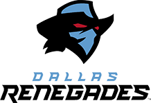 Dallas Renegades – This was a home run for me. Dallas did a great job of capturing their regional identity while blending it with a cool, non-mainstream name and an appealing logo. I try to judge based on those three characteristics and the Dallas Renegades hit on all three of those. The regional identity is in line with all of the other Dallas sports teams, including the NFL team Dallas Cowboys, while also not copying anyone and coming up with an original name. The Renegades is a perfect name for a football team, especially a Texas football team. When it comes to the logo, I stayed very impressed. The color scheme included a very appealing light blue color, black, and a little bit of red. I would expect the jerseys to be that light blue color and black which would make for some very, very cool jerseys. The logo design itself isn’t overwhelming but still features a very effective design. Overall, this is such a well-rounded team identity and is probably my favorite.
 New York Guardians – Well the team name itself could go either way for me, the other aspects of this identity make this a hit for me. Starting off with the color scheme, I believe this gray and red combo will make for some of the best jerseys in the league and look great on the logo. While I’m not sure if the logo is something I would automatically associate with “Guardians”, the logo looks really cool and is all tied together well with the 4 lines on the left. Overall, the color scheme and logo design make this identity a hit and I am really excited to see these jerseys.
 St. Louis BattleHawks – What actually is a BattleHawk? I have no clue but I love it; it is original and still sticks well with a St. Louis aerial sports team name. When it comes to the logo, it is great, they did a good job of creating a logo for something that doesn’t really have a logo. The logo also has a few easter eggs, real easter eggs @my AAF friends. When you flip the logo over you can see it spells STL and the two Ts in BattleHawks make a pi sign which is significant because the St. Louis area code is 314. The color scheme doesn’t make or break anything but is what you would like to see for that logo. Overall, it was an original team name that did a great job of constructing a new identity.
 Seattle Dragons – As one of the biggest Seattle Dragons fans, I was not in love with the team name at first but it grew on me. The name Dragons could be seen as a fine fit with the Seattle sports somewhat loose theme but the best part of it is the color scheme it allows. The name “Dragons” allows the typical Seattle green & blue which is necessary for a Seattle sports team but also allows them to implement their own twist, Orange. The orange will be unique to Seattle XFL and I think it will be really interesting to see how they implement it on the jerseys. The logo is also really solid as well. I’ve seen a few people say that they plagiarized the UAB logo but I could not disagree more. The Seattle dragon has vastly different features than the UAB one and it is not like UAB is the only team that can use a generic dragon in their logo. Overall, I love the color scheme and think it is perfect for Seattle sports and that is enough to make it a hit for me.
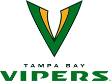
 DC Defenders – They knocked the name and the logo out of the park! Any superhero fan who is also an XFL fan will be a fan of this team right away. Red is a powerful color for a logo and the style of it looking like a shield with thunderbolts and stars makes it an original logo. Defenders hasn’t been a name that has been used and the logo is new so for me, any team that is able to use a different logo and name from other sports teams will get two thumbs up from me. I can’t wait to see the jerseys for this team.
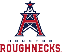 Houston Roughnecks – The Logo and design is what really did it for them here. The color scheme can go in many different directions with the predominant red white and blue. To implement the long standing tradition of the Houston oil industry with the emblem and team colors while subtly reminding everyone of the heritage of Houston football the XFL nailed it.
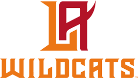 Los Angeles Wildcats – This was like saying good bye to an old friend. The last pro football champions in LA are no more, as the Xtreme hung up it’s jerseys and cleats on Wednesday. So, this is bittersweet for some of the original XFL fans. The team name ‘Wildcats’ holds historic significance as the first pro team to represent Los Angeles ( based in Chicago but a traveling team). To some, this name is considered to be old fashioned. When you are trying to be a contrast from a league that had insane asylum escapees, mob hitmen and orange meatheads, Wildcats is a very safe and smart play. It’s a classy pro sports name, and it fits the region as well, which is known for it’s bobcats, mountain lions and other members of the feline family. The branding on this one is interesting. No actual cat logo, at least not initially. The colors, like the name are understated. The interlocking LA logo is well done. This is a case where the rest of the uniform and overall look will determine the overall quality of this brand. The name, however, is great. Let’s see where it goes from there stylistically.


What a great article. That was a fun read that also made me laugh at the same time. This was a very fair and balanced article that showed how much subjectivity is involved in the process of reviewing any creative choices.
I don’t usually post messages. This was excellent.Great writing.
Great read. Well done by everyone at XFL Board.
The WILDCATS logo isn’t bad it’s just looks too laid back for my taste… The GUARDIANS nickname- it’s ok. I have to get used to it as I’ll be rooting for them.. Dallas will always be a sports city I hate. So I already hate the RENEGADES. Now having said that I’ll bet that they have the best uni’s. The logo could have added a few more features and reminds me of the old USFL Oklahoma/ Arizona Outlaws- the nickname is cool… Love the ROUGHNECKS. Hope they have black jerseys. Working with oil and stuff. Lol… Love the DRAGONS… The VIPERS-Nickname works, logo seems lazy… The DEFENDERS-UGGGH. Still better than the Red*****. BATTLEHAWKS-DAMN-This works!!! bet their merch outsells the rest of league. Good luck XFL!!!!
This article has enthusiasm. I can tell that reporters provided professional support for each #XFL team to show that the XFL is indeed pressing on to its greatest extent. Their details are relatable between cities and team names with some bits of historic accuracies. Makes me want to really look forward to this league to begin in 2020. I like to share a few thoughts with each team name. PLEASE NOTE: The conferences I placed the teams in are FICTITIOUS.
XFL Eastern Conference
1. NY Guardians – Inspired by gargoyles built on skyscrapers to keep demons out. Nice!
2. DC Defenders – Inspired by the founding fathers who fought and died for our country. Nice, but the logo should remove the bolts and keep the starts. The stars can represent the three branches executive, legislative, and judicial of our U.S. Constitution.
3. TB Vipers – Inspired by snakes instead of alligators. Not bad, but should’ve been called either the TB Gators, TB Venom, or something that relates to the bayou according to its team name video. For the record, the letter V could resemble the snake’s teeth.
4. HOU Roughnecks – Inspired by hard-working men collecting oil. Very inspiring to the recent NFL Houston Oilers then now the Tenessee Titans. Cool!
XFL Western Conference
1. DAL Renegades – Inspired by the gunslingers of the west whether ready to rob a bank, save people either in or out of town or seek revenge. Love it!
2. SEA Dragons – I can’t figure out the inspiration since dragons were a myth. However, the colors could be inspiring. If you look at Seattle’s professional teams, most of them embrace the colors green and blue. I don’t know where the XFL got that color orange from. But I’ll assume that’s their own color to blend with the dragon. It’s okay but could’ve tried the SEA Kraken or something sea-related. True that it’s a myth too, but it lives in the sea. And it has the color green… maybe.
3. LA WildCats – The logo looks great but the team name is terrible. Looked like as if they’ve watched a YouTube video of a wildcat at someone’s porch or backyard and got inspired to it. I’ll support the team if they simply call it LA Wild (remove the word Cats) or LA WildFire (blends the color red and orange, but best not to call that team name due to offending LA for its actual wildfires that occurred recently). It’s okay but not quite inspiring. The logo’s great though.
4. STL BattleHawks – The logo looks fantastic. I like the cleverness of how you turn the logo upside down, and you’ll see an STL formation. But the team name, however, sounded almost like the NHL St. Louis Blues’ rival, the NHL Chicago Blackhawks. True that both names are different, but the saying could almost sound similar. The logo’s great but the team name could use a slight update to avoid Chicago’s team name. I have a solution that also has the cleverness to it. If you change the word “Battle” with “War” (since both words share a similar meaning) and call them the STL WarHawks, then that would sound epic. And the cleverness is that along with turning the logo upside down to see STL, you can almost see the letter “W” (2 wings on opposite lengths and a sword on the center length) for the word War in its normal position. How cool was that? If you do that, then I would rank STL’s XFL team as the top best XFL team name above others.
Sorry that my statements were kind of long for some teams. STL’s XFL team was my personal favorite to explain a lot because of its logo’s clever imagery. Again, I’m looking forward to watching XFL games. I wish them the best of luck and hope they do not fail since the #AAF. Thanks for your time.
PS
Here’s my gift to @XFL fans since the @XFLBattlehawks went #KooKoo #KaKaw on Facebook group pages. In the words of Brad Pitt: And away we go!
XFL Eastern Conference
@XFLGuardians: #RoarRoar
@XFLDefenders: #DingDong (Liberty Bell)
@XFLVipers: #HissHiss
@XFLRoughnecks: #ClangClang (Hammer, Oil Can, or Oil Refinery)
XFL Western Conference
@XFLRenegades: #BangBang
@XFLDragons: #GrowlGrowl
@XFLWildcats: #MeowMeow #Scratch
@XFLBattleHawks (or XFLWarHawks): #KooKoo #KaKaw
Have fun!😁